Guide: How To Prepare Your Artwork
By Simon Daley
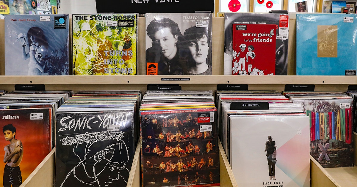
Pressing your first project? We asked Canadian musician and graphic designer Scott Orr to share some essential advice on how to prepare your artwork for the best results.
Record jackets, inserts, exclusive posters and liner notes are some of the best parts of collecting vinyl records. We want your project to look the best that it can, but a lot can go wrong if the files are not prepared correctly. The good news is that our in-house team of six graphic design experts review every piece of artwork before it reaches the print department. To prevent any delays or resubmission requests, we asked musician and graphic designer Scott Orr to share some essential tips to ensure your artwork submission is as seamless as possible.
Introduction (0:32)
TRANSCRIPT ⇲
“Hi I’m Scott Orr, I’m a Canadian musician, label owner and graphic designer. The team at Precision Record Pressing has asked me to share some essential pieces of advice to ensure that artwork submissions for your vinyl project go as smoothly as possible. Vinyl records are a uniquely special product and there are several quirks and particularities when it comes to the manufacturing process which can catch a first-timer out. This guide covers some of the most common issues that the graphics department sees and how you can get your printed elements looking their best.”
Templates (01:24)
TRANSCRIPT ⇲
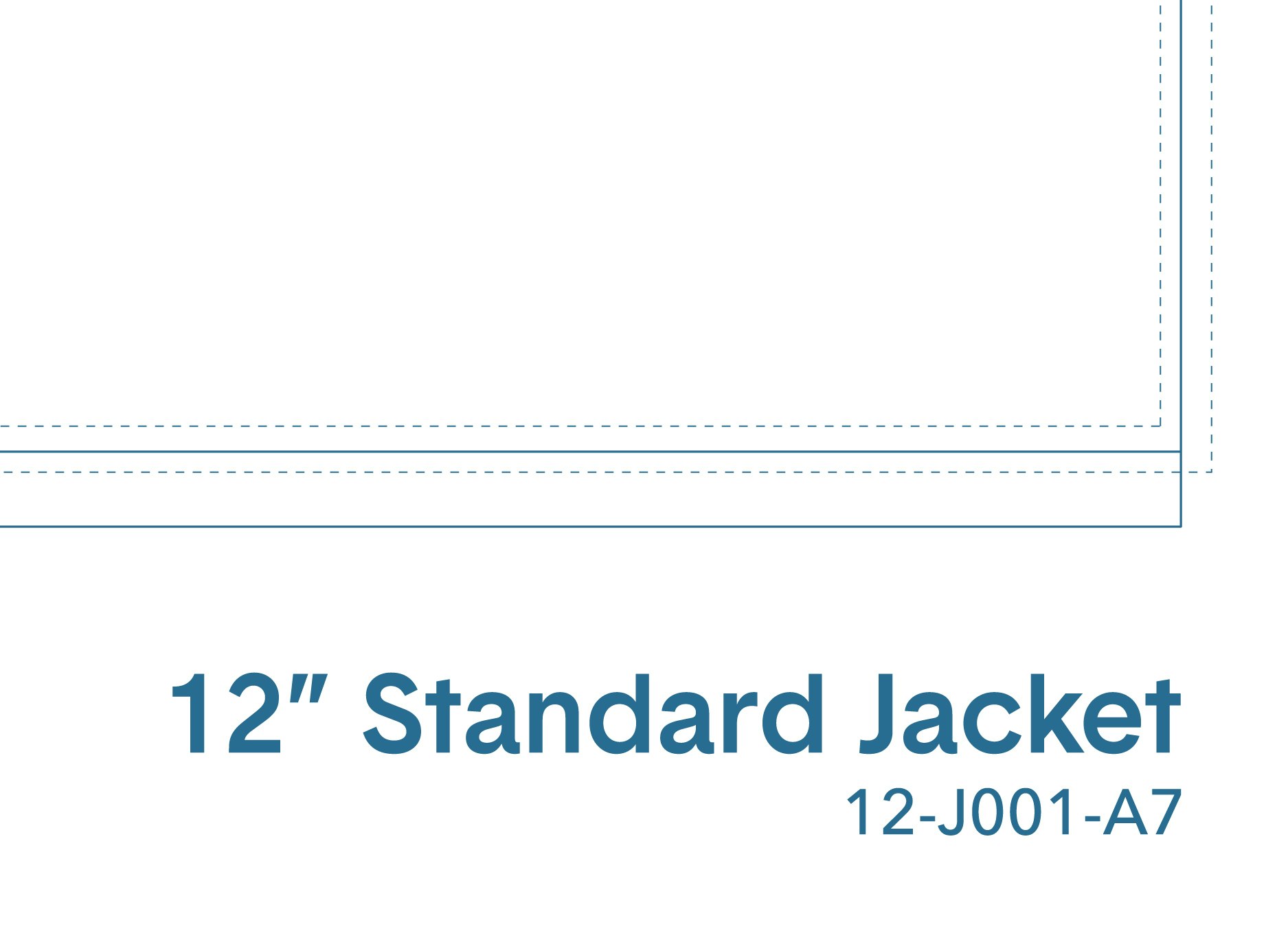
“Many vinyl record jackets, inner sleeves and inserts may look alike, but they’re not all built the same. PRP’s print offerings are a custom size and therefore your artwork needs to be supplied on the pre-prepared templates to ensure that it prints correctly. You can find all of the most common templates online at “precision pressing dot com slash templates”, but if your project includes a bespoke element like a box or custom insert then you will need to request a template from your account manager.
These PDF templates have been designed by PRP’s graphics team to be opened with Adobe’s Creative Cloud range of programs. For example when you open a template in Adobe Illustrator, you will notice that all the template guides are grouped on a single layer which is locked. Please add your artwork to the layer labeled “Art” and refrain from editing or moving the layer labeled “Template”, to ensure maximum accuracy. Whether you’re using Illustrator, Photoshop or Indesign please ensure that the color profile is set to CMYK, as opposed to RGB. If conversion is required further down the line, this could lead to the colors in your artwork shifting in the proofing stage. Images contained within artwork should also be a minimum of 300 DPI at source. Please avoid downsampling when exporting to ensure that imagery remains at the highest possible resolution for printing.”
Bleed & Margins (0:54)
TRANSCRIPT ⇲
“While printing and assembly technology has improved vastly over the past 130 years since vinyl records were invented, the process is still largely reliant on large analog machines controlled by people. Therefore tolerances like bleed and safety margins have to be allowed for when designing your artwork. Record jacket printing and folding is also occasionally prone to something called “press shifting”, where the printed sheets shift during the process. The print team’s quality control measures ensure that any copies with extreme shifting are discarded and recycled, but you can also mitigate the impact of this phenomena by ensuring that your spine text is well within the margins of the template and that important information is kept away from the safety lines. For the same reason it’s also not advisable to add a border to your printed artwork as it may print unevenly due to shifting.”
Typography & Fonts (01:15)
TRANSCRIPT ⇲
“Whether it’s the legendary work of Reid Miles at Blue Note Records or contemporary designers like Jeff Jank at Stones Throw Records, typography is one of the most memorable elements of any vinyl record project. When submitting your artwork it’s important to first outline your fonts, so that they become shapes and are readable by the graphics, pre-press and print departments without the need for the original fonts to be installed. If you’re using Adobe InDesign and would prefer not to outline your fonts, you can include them in the package when you export the project.
As a graphic designer I know from experience that some ideas which work well on the screen, don’t translate so well when printed on paper with ink. For example thin white text on a black background will often print poorly and may become illegible. Use the contact form on the website to speak to a member of the graphics team if you have specific concerns about your design and would like some advice.
Lastly, if PRP’s graphics team spots an obvious spelling error during the art proofing process they’ll let you know. However this is not a routine part of the art check process, so before you submit your artwork double and triple check the spelling throughout your artwork to avoid any errors.”
Artwork Color Shifting
TRANSCRIPT ⇲
“A common misconception is that vinyl record center labels are stickers, added to the record once it has already been pressed. In fact, center labels are adhesive-free paper labels, which are pressed into the vinyl compound at the same time as the audio grooves. To prevent them from cracking or warping in the steam press, the center labels are first dried in an oven to remove residual moisture from the water-based inks. As a result, the color of your center labels may shift during production. For example, bright whites may become ivory or cream-colored and light blues may take on a subtle greenish hue. Please use the reference images below as a guide to how the appearance of your center label artwork may evolve during the drying process.”
Related: 5x Common Artwork Mistakes
Barcodes (0:31)
TRANSCRIPT ⇲
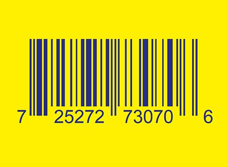
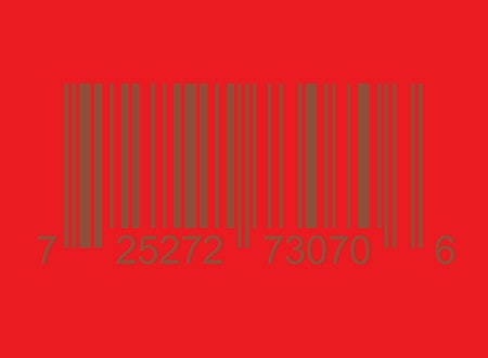
“Barcodes can be included on your record jacket artwork or alternatively you can request a barcode sticker be affixed to the external shrink wrapping or bag if you would like a more discreet appearance. Barcodes can be added to a jacket without a solid white background, but there are strict rules around compatible background colors, which have been extensively tested for their ability to scan. Check out the external link in this guide for a full breakdown of potential color combinations.”
If adding a barcode to your outer printed components, please limit the size of the white box to a maximum of 2” x 1”. Anything larger can cause scanning issues at point of sale.
Scanning & Special Effects (01:20)
TRANSCRIPT ⇲
“If you’re scanning elements to include in your artwork, you should familiarize yourself with the optical effect called Moiré. In this instance, Moiré is a pattern created when two or more grids intersect one another and create visual interference. It often occurs when printed images are re-scanned incorrectly and should be paid close attention to. Check out the external link in this guide to learn more about how to avoid this affecting your artwork.
Special colors like Pantones should be set up where necessary from the Pantone Coated Palette, with no less than 50% transparency and must be set up in Adobe Illustrator or InDesign. Any design elements using white inks must also be supplied as a vector, with a labeled spot swatch. Similarly, areas requiring spot gloss should be presented as a vector or bitmap and the layer labeled “Spot Gloss”, to avoid any confusion during processing and printing. This also applies to any other special print effect, such as hot foil stamping or embossing, as well as full-side vinyl effects like silk-screening and etching.
If you’re unsure about how to set-up advanced elements like Spot Gloss or Pantones then please contact the graphics department via the contact form on the website, selecting “Graphics Department” from the dropdown menu.”
Recorded and mixed by Scott Orr at Other Songs Studios.
For more information visit otherrecordlabels.com.
Header feature photo by Mick Haupt.
Record stack photo by gotafli.