Guide: 5 x Common Artwork Mistakes
By Simon Daley

If we’re talking about the importance of first impressions, then vinyl record artwork is the ultimate tool for standing out from the crowd in a packed record store.
We spoke to Becca Howes, Graphics Coordinator at Precision Record Pressing to learn about the five most common mistakes that designers make when submitting their artwork for proofing and printing. Often the most common errors are also the simplest to fix. However when ramping up the intricacy of your design/printing errors can become complex to undo, so we encourage you to read this guide to ensure your designs are set up correctly from the start.
-
Document Setup (RGB vs CMYK) & Templates
Ensuring that you set up artwork in the correct manner is the easiest way to avoid unnecessary rejections and amendments by our graphics team later on down the line. All print documents should be set up as CMYK for full color artwork or grayscale for one color artwork, then transferred to the official Precision Record Pressing PDF templates before submission. Templates can be downloaded here.
-
Bleed & Image Resolution (DPI)
All our templates contain guide markers for including bleed in your designs as well as a safety area in which you shouldn’t place any text or important design information. This is necessary to ensure that we’re able to produce a clean and professional print finish. Failure to supply artwork documents with bleed will result in the need for a re-submission.
A common issue we also run into involves the low resolution of photos, images and scanned elements often included in artwork. Whilst this issue may not always present itself clearly on a computer monitor, it can become more apparent when transferred onto paper for jackets, sleeves and other printed items. Check the dots per inch (dpi) for all your images before submitting; for scanned elements we require a minimum of 600 dpi, but recommend scanning at 900 dpi or above when possible. The final print files should be at least 300 dpi.


-
Outlining Fonts & Embedding Images
Our graphics team encounters hundreds of different fonts each year and rarely are they standard fonts commonly pre-installed onto operating systems. When submitting your artwork files all fonts should be outlined, if they’re not outlined and the relevant fonts are not installed on our system they will not display correctly during printing and an artwork re-submission will be required. We also recommend outlining all fonts, as vector-based graphics produce the highest quality printed results. If in doubt, please provide a folder containing all the fonts and images used in the file so they can be referenced or properly embedded by the art team.
Images included in artwork files must also be embedded to ensure that they display and print at the highest resolution. If sending native InDesign files, please ensure your art is packaged correctly when you export the file and send it to us. Failure to embed images correctly will result in missing or low resolution images and will be flagged for a re-submission.
-
Print Incompatible Design Choices
There are many choices that a designer can make which look impressive on a screen, but may not translate well when printed onto a record jacket or center label. Commonly seen issues like thin white text on a dark background (which may be illegible due to the darker ink flooding the small white area) or a detailed border with tiny elements on your jacket may be flagged and a re-submission requested. Other commonly encountered issues include:
- Moiré effect – digital looking dotted or lined pattern that often occurs when printed images are re-scanned incorrectly. For more information via an external resource click here.
- Supply of spot gloss/foil/etching/etc art as Photoshop/rasterized files. We will ask for a re-submission if not provided or if the client is unable we’ll attempt to convert it to vector ourselves which is sometimes difficult.
- Printers recommend that any single CMYK ink percentage should be above 5% (if used) to ensure visibility (example: C-3% M-17 Y-6% K-0% ← in this case, the C should be at least 5%, the K is acceptable as none will be used).
- Barcodes on backgrounds with little contrast or busy backgrounds.
-
Special Print Effects Setup
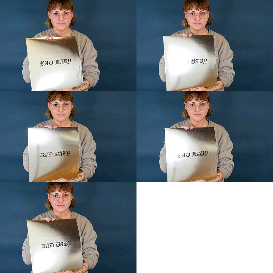
Special colors like Pantones should be set up where necessary from the Pantone Coated Palette with no less than 50% transparency and must be set up in Adobe Illustrator or InDesign. Any design elements using white inks must also be supplied as vector, with a labeled spot swatch. Similarly, areas requiring spot gloss should be presented as a vector and the layer labeled “Spot Gloss”, to avoid any confusion during processing and printing. This also applies to any other special print effect, such as hot foil stamping or embossing, as well as full-side vinyl effects like silk-screening or etching.
If you’re unsure about how to set-up advanced elements like Spot Gloss or Pantones then please contact our graphics department via the form on our contact page, selecting “Graphics Department” from the dropdown menu.